A newly released image captured by astronauts aboard NASA’s Artemis II mission quickly went viral after viewers noticed a surprising difference compared to one of the most famous photos of our planet ever taken.
On April 1, 2026, Reid Wiseman, Victor Glover, Christina Koch, and Canadian Space Agency astronaut Jeremy Hansen embarked on a journey of more than 4,000 miles toward the far side of the Moon aboard the Orion spacecraft as part of the Artemis II mission — the first crewed voyage to lunar space in over 50 years.
Over the 10‑day flight, the crew is testing technology designed to support future Moon missions and human exploration of Mars.
As the spacecraft continued toward the Moon following the translunar injection burn, the crew captured views of Earth from deep space that quickly drew global attention.
Earth in 1972 vs Earth in 2026 Mission Commander Reid Wiseman photographed the planet through one of Orion’s five windows, producing remarkable images with a Nikon D5 — a full‑frame DSLR released in 2016, according to David Melendrez, the lead for Orion capsule imagery integration at NASA.
“There are no words,” Wiseman captioned one image on X showing his profile with a curved section of Earth visible through the spacecraft window. He also shared another photo capturing the rich colors and sweeping white cloud formations of Earth suspended in the dark backdrop of space, speckled with bright stars.

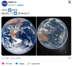
“We’ve come so far in the last 54 years, but one thing hasn’t changed: our home looks gorgeous from space! The left view is from the Apollo 17 crew in 1972, and the right was captured yesterday by the Artemis II crew,” NASA wrote in its April 3 post, which paired the 2026 image of Earth with the iconic 1972 photograph — a comparison that quickly sparked discussion online.
‘Earth is visibly diminishing’ Social media users soon shared theories about why the new image looked different, with some wondering whether environmental changes could explain the variation.
“The latest view of our planet Earth captured by the Artemis II crew is both breathtaking and sobering,” one user tweeted under NASA’s post. “This image isn’t just a symbol of progress in space exploration — it’s a reminder that while humanity has advanced technologically, the ecological cost has been profound.”
“In 1972 she was vibrant. Now she looks tired and fading. The Earth is visibly diminishing, losing its color and its glow. It’s a dying marble. If you can’t see how we failed her, you’re delusional,” wrote another commenter.
A third user mentioned “so much pollution,” while another asked, “Why does the one from ’72 look better?”
‘Sensor’s sensitivity to light’ Despite the speculation, several observers pointed out that the perceived difference may come down to photography conditions rather than environmental changes.
One commenter explained that the image shows the side of Earth not directly facing the Sun, which naturally appears darker.
“What you’re looking at is actually the night side of Earth, opposite the Sun. It looks grainy because the image is hyper‑exposed for visibility,” they wrote.
Another user offered a more technical explanation, noting the camera settings used to capture the photo.
“Why does it look more washed out than the one from ’72? Because the side of Earth in that photo is nighttime — if you zoom in, you can see the glow of city lights. But how can it look like daytime? Because the photo was taken with a super‑high ISO of 51200! ISO is the sensor’s sensitivity to light,” the user explained, reminding followers that Wiseman used a Nikon D5 to take the images.
‘Pure magic’ “The most magical thing about this photo — even more than the northern lights — is how you can see the sunlight, which is on the other side of Earth, illuminating our atmosphere,” he continued. “That’s pure magic, because that atmosphere has a composition so precise it allows life, as we know it, to exist. This photo is a precious gift to humanity.”
In other words, the visual differences may reflect lighting conditions and camera sensitivity rather than changes to the planet itself.
‘That’s our home’ While much of the online debate focused on technical details, the image ultimately offered something far greater — a reminder of how delicate our planet is and how deeply connected we all are to the place we call home.
“When you see all the strife and the things going on in the world today, I think it’s really important to see us as a whole,” Melendrez told National Geographic. “You look at that picture — there are no borders in that picture, it’s just all of us. I think one of the biggest things we can take from this is reminding everybody that that’s our home. And we all have to share it.”
What are your thoughts on this remarkable new view of Earth? Share this story and join the conversation!